Friday, April 9, 2010

Abstracting the Human Form - Bill Bradnt & Edward Weston

Both of these artists really attracted me because of the different way that they looked at and photographed the human body. Below is some of Bill Brandt's work. I love the setting on the rocks, because it makes the subject seem as if it's grow out of nature, rather than a person has just been placed there.


The interesting thing about Edward Weston (below) is the incredibly similarity between the way he represented both the human form and the organic non-human form (like in plants and vegetables). It often makes one question whether or not the subject is human.


What really strikes me about both these artists is the contortion of the human body and the isolation of its parts. While the body extended and as a whole is beautiful and interesting, its something I think we all have seen before in many different ways. But the abstraction represents a unique point of view. To me, both artists seemed to be drawing a parallel between man and the rest of nature, by emphasizing the organic nature of our form. In doing so, these images have the ability to change the way one looks at their own shape.

Wednesday, January 27, 2010

Portraits and Self-Portraits

So, I haven't been feeling all that inspired with the self-portraiture assignments. Although I really loved the work of many of the artists we've talked about, I don't feel that much of a connection to any of them.

For instance, I have always liked Frida Kahlo's work, but it inspires me more as a painter than a photographer.


I was completely amazed by Francesca Woodman, as well, mostly just because of the incredible way she uses the shape of the body and other objects in such an abstract way. I particularly liked this image:


The circular movement of the image and her body is amazing, really emphasizing the bowl in the center. Your eye cannot help but be drawn to it. The contrast of the white bowl with the very black snake emphasizes the shape even more. Her body, being gray, makes it really almost blend into the rest of the image.

I like this image a lot as well:

I kind of like that, if you look closely, you can see the line holding the articles of clothing or pieces of fabric. The composition is amazing, with the contrast of the black fabric and the very white background. It seems as if the fabric is meant to be hiding her body, or maybe to emphasize the line of her body.

I liked a lot of Cindy Sherman's earlier work, too. It's really mind-blowing how she is able to transform herself through costumes and makeup. It's pretty spectacular.


All the women she's portraying seem to have a very specific story. I think I'm mostly drawn to these particular images because of the era in fashion and history that these costumes are portraying. I really love the one where she's reaching to the bookshelf. The entirely white clothing with the blonde hair creates this ultra-feminine, pure kind of archaic image of a young woman, and her attempting to reach for the books– for knowledge, or education, or self-sufficiency– contradicts that. It seems to say something about the 1960s (maybe late 1950s, as the clothing seems to represent) and the role of women at that time.

While I really like all of the self-portraits of these women, there are a lot of artists who focus on portraits of other people that I really respond to. For instance, in class, we briefly talked about Jospeh Szabo, but I have been familiar with his work for a few years now and I really like his images of teenagers. I love the simplicity of Richard Avedon's portraits, too.

There's one painter, Lori Earley, whose work I have loved for a while now. She is a contemporary, young painter from New York, who studied at SVA. She exclusively paints highly stylized portraits of women, generally in oils. She's had solo exhibitions all over the world, including those in New York, London, Seattle, and L.A.

Here are some examples of her work:


I love the ethereal, emotional, almost haunting quality of her portraits. I think the enlarged eyes really add so much emotion and depth to the women in her portraits. I think it might be really cool to try to recreate the same kind of feeling and energy in my own photographic self-portraiture.

Tuesday, November 10, 2009

I Really Need a Digital Camera

But I really have no idea what to buy, when to buy, where to buy, etc…

I'll figure it out I guess.

Saturday, July 25, 2009

Castillo de San Marcos, St. Augustine, FL - June 2009


I took these a while back on a trip to St. Augustine. The Castillo de San Marcos was a fort built during the Spanish control of the region in the 1600s. Little piece of history for ya' there…

I visit St. Augustine a lot, since my sister lives there and my family has a vacation home there, but I have just now gotten around to taking some photos. "Old Town," or the tourist section of the city with all the historic buildings, has some really beautiful and interesting architecture, but I always forget to bring my camera. Anyway, I have some more of these Castillo shots, but these are the ones I liked best. Most weren't cropped well because I had to have the film sent out to be processed, but the negatives look much better than the prints.

The photos were taken throughout the fort, from the cannons on the roof to the chapel to the military barracks. You can't see it in most of these indoor shots, but the creepiest thing about the building are the carvings made by soldiers (and prisioners) in the walls, some practicing their English alphabet, and some writing names or messages, most of which are illegible, unless you speak 17th century Spanish.

Too bad there aren't an ghosts in these pictures :(

Thursday, March 26, 2009

John Gutmann


John Gutmann was born in Breslau, Germany in 1905. In his photography, he was well known for the use of the "worm's eye view," or a view from a very low point on the ground. Throughout his career, Gutmann worked as a professor at San Francisco State University and is considered the founder of the school's photography and modern art programs.


The above photo was taken of Olympic diving champion Marjorie Gestring in 1936 and is entitled, "Class." One can only assume that Gutmann was using the title to comment on the class of Gestring, or perhaps her grace as an athlete which projects class. The overall composition of the piece emphasizes Gestring in every aspect. For instance, the massive amounts of negative space surrounding the diver draw the viewer's eye right into her. The darker gray of the background also presents a contrast between the sky, and the highlights on Gestring's body. Similarly, the empty space, as well as the angle of her body and the camera, and the exclusion of most of the diving board all add a surreal quality to the photo, emphasizing the actions of the subject. What is she doing? Is she floating? If the viewer did not know the history of the photo, it could be interpreted a different way. For example, the diving board may just look like the tip of an airplane wing, and Gestring perhaps flying beside it.
 

Sunday, February 22, 2009

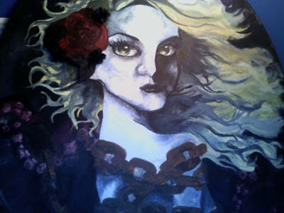
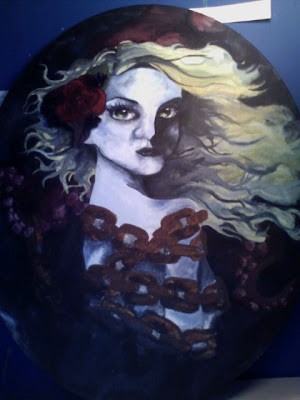
I've just finished this painting I've been working on for a few weeks now. I'm really happy to finally have finished a painting outside of schoolwork, so it's the first "original" in a while, I guess you could say.

Here's a close-up, and then a full view. It's done in acrylic on a oval canvas.


Wednesday, January 28, 2009

What Is… ?

GOOD? Beautiful. Interesting. Unique. Makes you think. Trying hard. Inspiring. Love. Effort. Appreciation.

ART? Anything. Painting. Music. Sculpture. Inspirational. Imagery. History. Documentation. Objective. Experimental. Evolving. Feeling.

PHOTO? Composition. Art. Imagery. Memory/momento. History. Personal. Objective. Variable. Experimental.

ME & PHOTO? New. Exploration. Education. Art. Difficult. Trying. Impatient.

CONSEQUENTIAL ASSIGNMENT: Look for high contrast, especially created through interesting natural light.